
Comms Team Newsletter – 02
It’s our mission to make sure employees engage with Darwin and their benefits. The Buzz tells you how we do it.
We hope you enjoy reading and let us know what you think!
Glasgow gold
A creative collaboration
Back in May, when it was still light at 4pm, we travelled to Glasgow to spend two days with Clydesdale Yorkshire Bank (CYB).
Kicking off communications can take many shapes or forms and it’s easy to make lots of assumptions about a client before you step in the door (based on their sector, size, PR… something you heard from your nan).
But the team at CYB are unique, and pretty special.
Going BIG with branding
Historically, banking hasn’t been the most daring of industries, typically you’re looking at something fairly traditional and corporate. Instead, we met one of the most dynamic and brand aware teams to date.
We’re used to discussing branding harmonisation after a merger…this time we were faced with ‘life after the demerger’ and the task of creating a new identity. They wanted to reinforce who they have become: a forward thinking, engaging and dynamic bank.
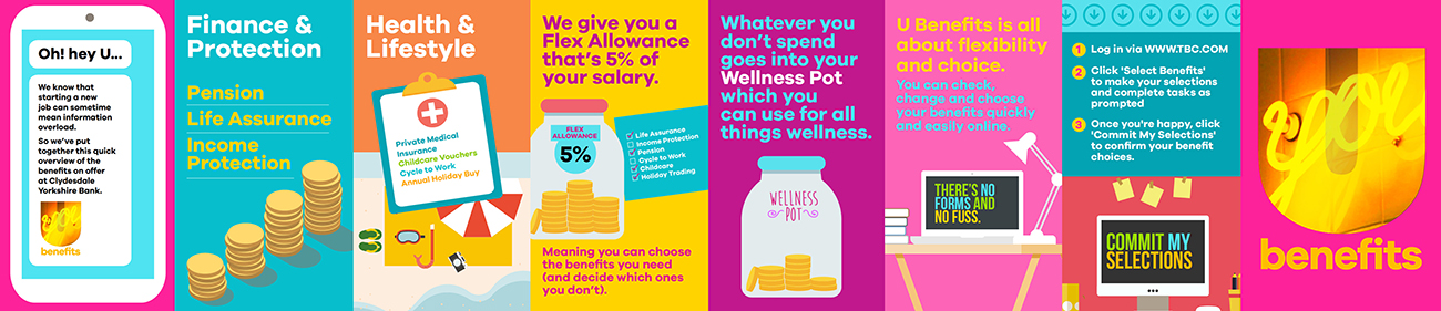
Taking inspiration from their prototype banking/ideas lab branding ‘B’ we developed U Benefits. A brand that we hope is as fun and individual as every employee.
Cutting the corporate copy
In the same way that the creative team were given freedom to push the visuals, we were also able to push the strategy and produce fun, energetic copy.
We created a brand personality that let us speak to employees honestly, stripping back corporate/paternal tone.
Most importantly we worked as an extension of the CYB internal comms team; with a joint engagement plan and lots of discussion, debate and laughter along the way…
Bringing it together
The proof is in the pudding and who doesn’t love dessert! So if you have exactly 3 minutes and 17 seconds to spare… then watch our shiny animation below – just one of the pieces we put together for CYB.
Powers of persuasion
“We want to increase employee engagement with our benefits.”
Something we (never) tire of hearing in the Comms Team. Usually accompanied by a small budget to play with and an aversion to change. Oftentimes our clients think of change as having to be something drastic or radical. And sometimes it does. But most of the time you can get results with small changes.
Munich Re is a regular comms client who suffers from little appetite to shake things up. If it ain’t broke, don’t fix it right? Not this time. Even if a client thinks their brand is the best thing since fidget spinners, sticking to the same language, look and feel or channel can have the reverse effect on a campaign.
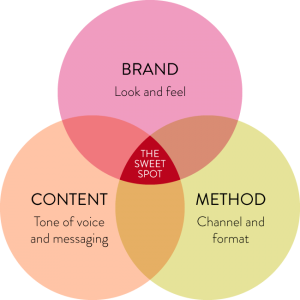
To get cut-through with audiences, we tug on any or all of these three levers:
Munich Re does posters every year for their benefit selection window. This year, I challenged them to try a different tone of voice. This approach is often overlooked as an effective way of engaging employees, perhaps because of its simplicity (compared to trying new channels like animation or refreshing a brand). But when every poster in the office looks and sounds the same, how do you expect yours to stand out?
We presented three poster copy options with varying degrees of risk: samey, moderate change, OMG ARE YOU CRAZY?!
Here’s how it looked
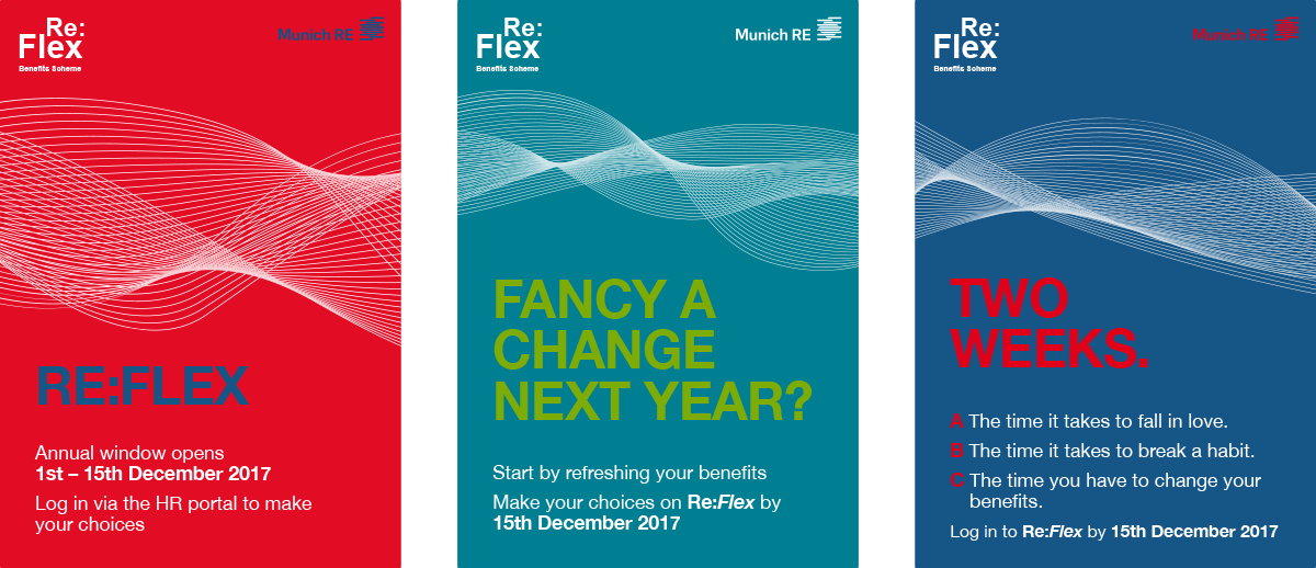
No prize for guessing which one they chose.
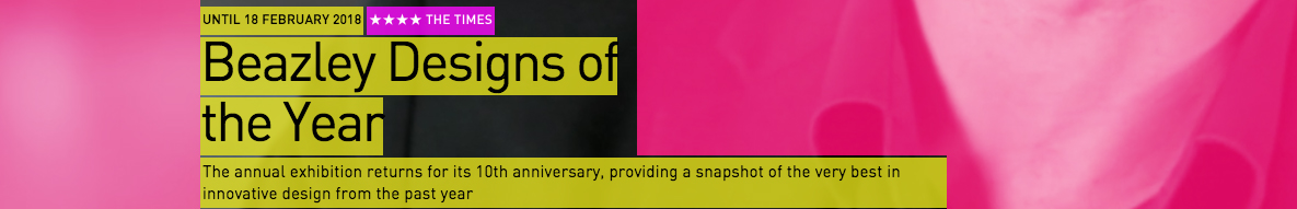
Beazley Designs of the Year
at the Design Museum
From political posters to ink made from air pollution to drones used for search and rescue, we went to see designs from across the world in the Awards’ tenth anniversary year. On display are 62 nominations, showcasing the work of both established and emerging designers across six categories: Architecture, Digital, Fashion, Graphics, Product and Transport.
From each category our highlights (and the ones we nominated) are:
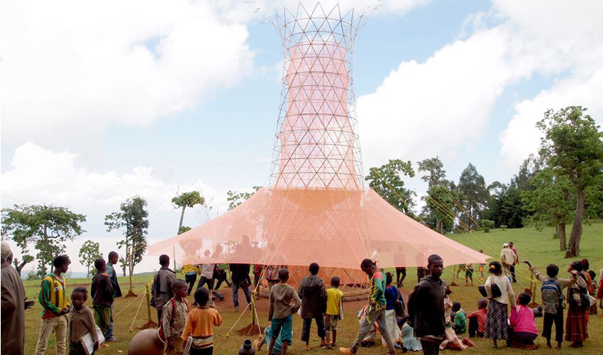
Architecture: A water tower that harvests the sky by Arturo Vittori.
A ‘rain butt’, fog catcher and dew collector in the form of a twelve-metre-tall bamboo tower, that is able to collect 100 litres of clean drinking water every day.
Digital: A company at the frontier of 3D printing by Joe Doucet, Dean Di Simone and Evan Clabots.
A New York-based firm is transforming our notion of 3D printing by producing premium made-to-order domestic objects in porcelain, bronze and steel.
Fashion: A coat woven from ocean waste by Javier Goyeneche.
This upcycling project known as ECOALF; removes waste from the seabed and converts it into raw material from which can be made footwear, clothes and accessories.
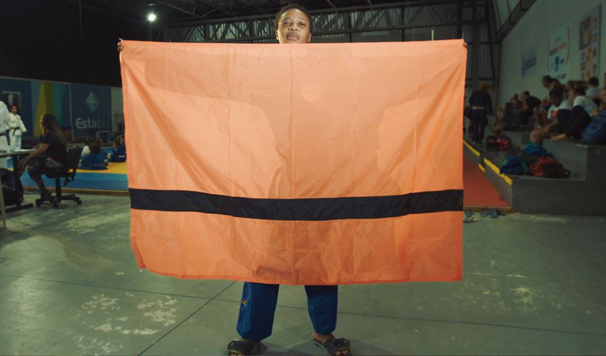
Graphics: A flag for the stateless by Yara Said.
The simple and striking design of this is inspired by lifejackets, an emblem of hope for refugees in their modern-day exodus.
Product: A way to talk face to face in any language by Waverly Labs.
This design consists of two linked earpieces and an app, that uses speech recognition and machine translation to convert spoken language almost instantaneously.
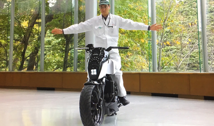
Transport: Motorcycle that won’t tip over by Honda.
The technology, named Moto Riding Assist, has been designed to reduce road accidents, particularly at low speeds.
Responses to our wasteful environment feature prominently, with designs such as a biodegradable chair. With this in mind, a move towards Upcycling is seen in designs such a Scooter that was 90% handcrafted from locally sourced materials including camel bone, and the Ocean waste coat mentioned above. Upcycling, through the addition of design, transforms waste items into something new, without breaking the product down into raw materials. Instead it gives old objects new value and new life.
In conclusion, we know that what separates design from art is that is it has a purpose, a message; it exists not just to be beautiful, but also to function. Now more than ever we are seeing this ‘function’ work towards creating a better planet, a better environment, and a better life. With the use of data and technology, products are constantly moving forward to ensure that their purpose is one that benefits us all.
Global domination (Comms style)
Comms is meeting the challenge of more global roll-outs head-on. This means finding different ways to add comms magic while making sure what we do works in different cultures.
It’s fair to say there’s no such thing as a typical global comms approach but they do have some things in common.
Big up for Darwin
Nailing the way Darwin looks and how it caters for different groups is really important to these clients. With our new branding and content workshop we help global clients set a framework which works for all phases, and all regions, of their roll-out.
Getting tooled up
Country by country comms support isn’t really very practical (or affordable) for most clients. This is where our handy toolkit approach comes in! Everything we create in phase 1 of a global roll-out is designed to cater for all phases. Once it’s done, we’re out (mic drop). The client has everything they need to communicate right to the end of their roll-out.
Consistency verses cut-through
Global comms needs to pull off a tricky balancing act.
1. Resonate with people from all over the world.
This usually means using corporate branding, values and tone of voice as the starting point. If you want everyone to relate to it, it needs to draw on what’s common across the business.
2. Get people’s attention.
So that means do something different, get noticed amongst the background noise of business communications. Standing out.
You see the problem?
Well we love a challenge and there are loads of ways we can help clients with this comms conundrum. Want to know more? Check out the following two examples.
More is more
Change up the channels
New year, new you…
at least it is for Kantar
For their benefit selection window this year Kantar underwent a brand refresh. In a change as drastic as Hannah Montana’s manifestation into Miley Cyrus, they’ve come out the other side with a brand that slays.
Before
Kantar’s original ‘My Life My Choices’ brand was highly recognisable and aligned closely to their core external branding. With the photographs of benefits in circles and handwritten type it had a playful tone that engaged its audience.
After
Our challenge was to keep in line with their external branding but change the emphasis from their core black and gold colours, to their secondary ‘bright and bold’ palette. They wanted an impactful, fun and engaging design using a photographic style similar to their in-house work, with a gold tint, that is personable.
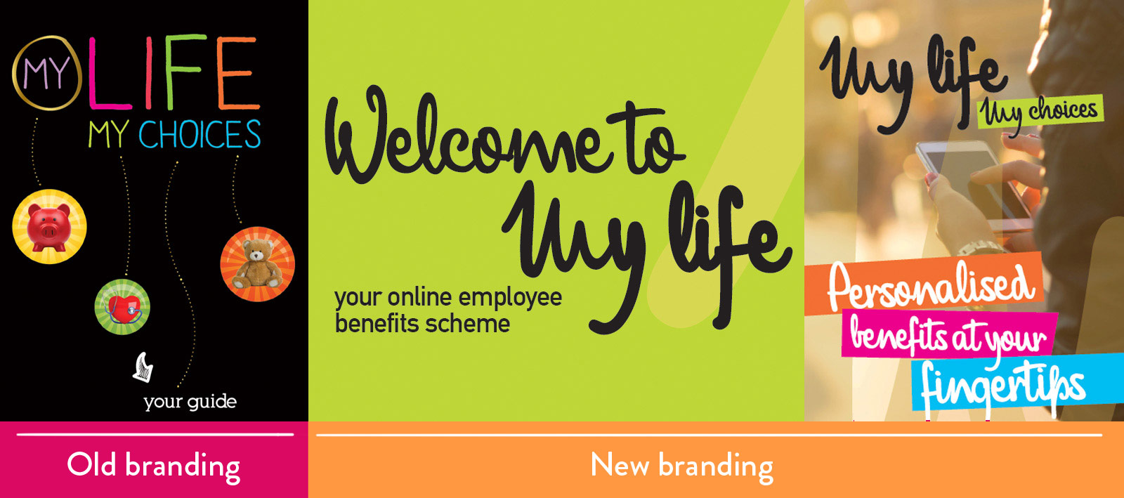
As you can see there is a very large contrast between the two, however both still align to their core branding. This shows how a brand can have a very different visual style while maintaining its roots.
Think your client might be ready for a makeover? Drop us a line.
Thanks for reading! If you have any thoughts…
Love, The Comms Team 😉